Identity
A handful of the Logos, Naming & Materials I've enjoyed working on.


EquiZen
Equizen was entering a more competitive sporthorse market and needed a brand overhaul to suit. After a brand analysis and competitor analysis we determined the best brand persona and aligned the service with the hearts of target customers. This resulted in a bold energetic identity combined with an asian ink stamp fitting the accupressure services offered.


Jacqurei Oaks
An equestrian paradise, Jacqurei Oaks is a full service horse riding, boarding and training stable. This logo embraced the namesake of the massive oak trees on the property by surrounding a traditional horseshoe with acorns.


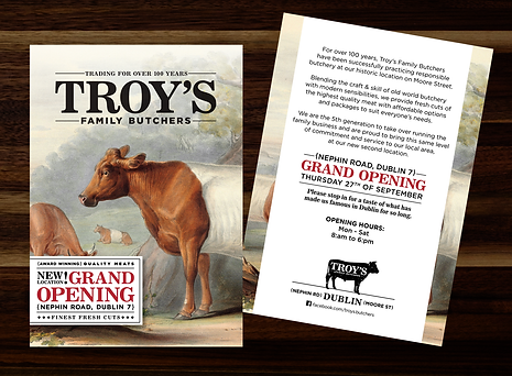
Troy's Butchers
With a family run history of over 100 years, Troy's is the oldest butcher shop in Dublin. When they expanded to a second location we evolved their logo along with fabricating a new awning and creating Grand Opening collateral. We're also making some updates to the original shop to better embrace the historical significance.


Victory Tree Services
Victory Tree Services had a generic leaf logo that many other companies were also using around town. It was time for an upgrade that was as unique as their customer service.

Jim Lunt llc
Jim Lunt & Associates focus on eco-friendly biodegradable plastics. They work globally, particularly in Asia. This simple design was inspired by Japanese circles and the shape of the planet while using green to represent the earth.

Adams Glass & Mirror
Adam's glass and Mirror needed an identity system to get their business up and running. After watching how they installed glass, it occurred to me that the characters legs made a perfect A shape while lifting glass with suction cups.

Wondergirls Marketing
Wondergirls wanted a fun sassy logo for their new marketing venture. We chose a unique styleguide, colour pallet and the tagline "Stop worrying, start wondering".


KidQuencher
KidQuencher combined two of kids favourite products into one — a water gun and a hydration backpack. It encourages kids to drink more water in a fun way they can also share with friends. The fun little droplet logo worked perfectly as a zipper pull and retail hang tags. I also created the product backpack and gun designs and illustrated the material patterns that the backpacks were printed with.

The Humane Society
The Humane Society of Illinois was hosting a rinkside charitable event with the Bloomington Bisons Hockey Team. We created this logo to sell hoodies and raise money toward the much needed care of the beautiful shelter animals.


PureCare Identity Update
Purecare had an old logo that was difficult to incorporate into packaging due to being left top-heavy. I reduced their old script font with 3 petals to a singular modern design and created a handmade typeface with the same rounded edges as the petal. There have been multiple iterations since this one but I still rather like it so decided to show it here.
OLD LOGO

PureCare SoftCell
PureCare made an amazing adjustable chambered pillow and needed a name and wordmark. The "o" in soft is made to represent one of the "cells" and for a cleaner airy feel the registration mark is incorporated into the type. I was also fortunate to make the embroidered labels for these pillows as well as packaging for multiple lines.

PureCare Essentials Technical Textiles
PureCare needed a new Sub-brand that focused on their revolutionary technical textile bedding products. The conceptual brand imagery of women falling into REM sleep represent a deeper more healing sleep created by these textiles as they "Drift into a new Dimension of Wellness". The logo breaks up the old traditional PureCare petal logo into different dimensions.

MarketJuice
Deluxe was branching out from making checks to business materials and marketing. They wanted a logo for this new endeavor that was a little bit spicy.

12 Course
LifeTime Fitness was starting a new nutrition program based of the concept of "1-2-12" — a structured eating plan focused on consuming one protein shake and two real food meals, within a 12-hour eating window each day. The program promoted healthy eating habits with flexibility based on individual needs and schedules.

Vismail
Vismail America needed a simple identity system and business card to promote their innovative solutions for businesses, streamlining operations and enhancing productivity.
